
What this case study demonstrates about me
Resourcefulness under constraint, ability to translate user feedback into actionable design, demonstrable impact on user engagement (traffic), and improving core functionality (filtering, visualization).
The context
Nominet’s Social Impact team had a tool which they had designed called Digital Youth Index. It had been constructed with the help of an external digital agency. Its purpose was to filter and display data from a large dataset to answer specific questions about how young people used digital technology and to explore digital poverty.
The team were in the middle of receiving feedback from internal users. They had collected together a list of tasks that they wanted users to perform and the results would form actionable feedback around which areas of the tool to prioritise with the agency.
The users attended a session with the project stakeholders, were asked to perform the tasks within a time limit.
The team had summarised the raw data and added some of their own qualitative findings from while they were running the session.
The initial problem
The data provided by the tool was viewed generally as good and useful. However, users reported that…
- the filtering was difficult to both find and use - a key feature of this tool so this needed urgently looking at. One issue was that the tab on the side used unfriendly wording and was not obvious enough.
- too little of the screen real estate was used for showing the actual graph and that too much scrolling was required to actually see the visualisations. Filtering, a key feature, was difficult to find and use due to unfriendly wording and insufficient prominence
- the tool was slow to update data and data changed in the middle of using the filter rather than a filter being applied.
The project team reported that the initial tool had a low task completion rate; 11 out of 16 users (68.75%) were unable to complete key tasks within the given time limit, indicating significant usability issues with filtering and data display. One quote was “Lots of frowning and concentration throughout indicated that the tasks were not easy or intuitive for many of those present.”
Since all of this was using public benefit company money, the budgets were SUPER tight so not many changes could be made - either lots of easy, small wins or a couple of big ticket items.
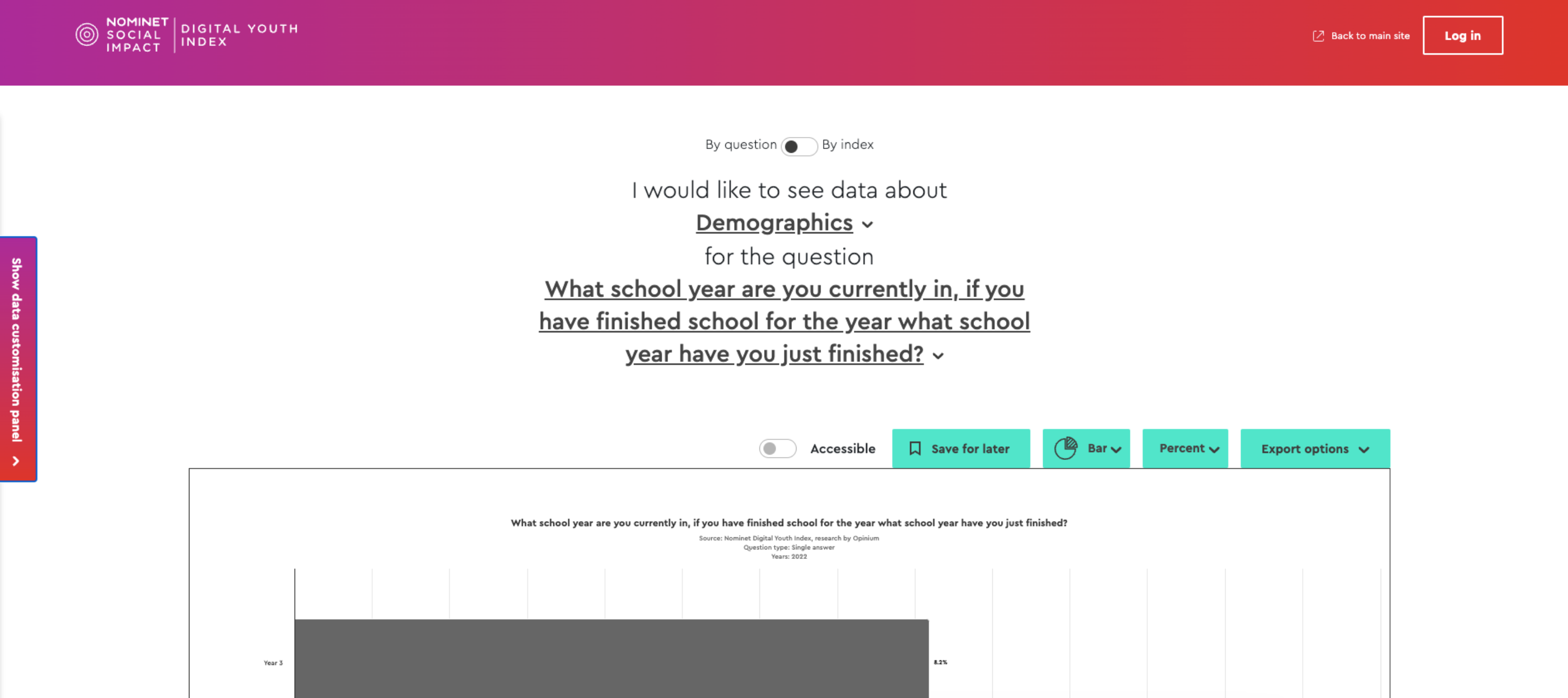
Screenshot to illustrate that the visualisation required scrolling to actually see the data and that too much of the screen was being used inefficiently
The proposals
Operating under the aforementioned SUPER tight budget, I employed UX best practices and user feedback to develop lo-fi sketches, proposing solutions that required minimal new code for significant layout improvements, such as maximizing graph visibility 'above the fold' and changing question selectors. Since I wouldn’t be doing the large parts of the work, I had to explain these in a way that would be easy for our team to understand and then convey back to their agency.
I started by taking a summary of the feedback the DYI team received and made some bullet points for how some of these issues could be addressed.
I presented these to the DYI team at Nominet and they were happy. They also shared with me some of the ideas from their digital agency, which were reassuringly similar.
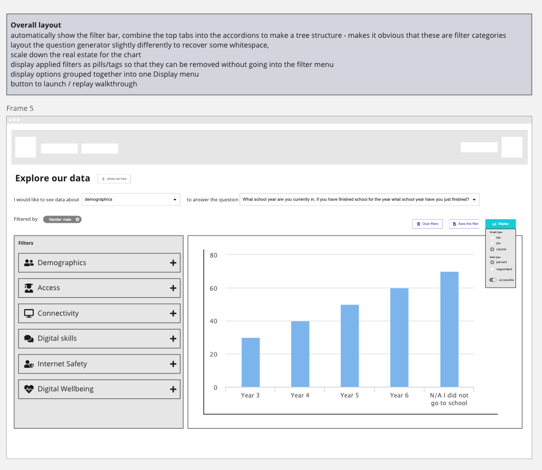
Lo fidelity sketch to quickly convey ideas around how the layout of the graphs could change from the screenshot earlier - more of the graph visible above the fold, vertical bars by default, question selectors laid out horizontally
The outcomes
The main points of change were:
- accessible colours ALWAYS used for the graphs rather than be an option
- the implementation of horizontally laid out question selectors and more visible filter starting points significantly improved navigation and maximized available screen real estate, addressing critical user pain points
- a loading spinner whenever the graph filters change
- more visible filter starting points
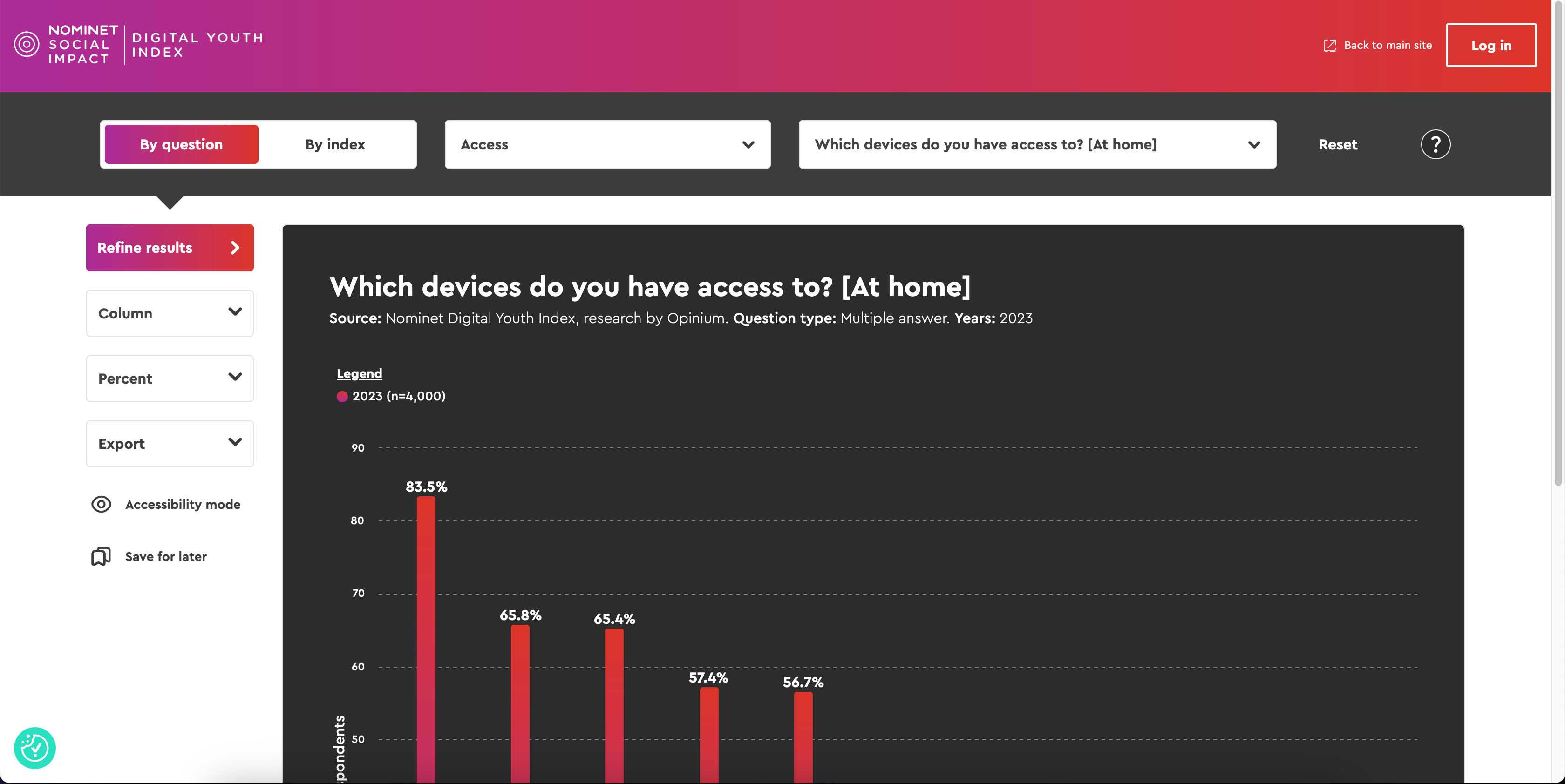
The result of the UX work! a much easier to navigate graph, more real estate given to visualisations, questions displayed horizontally, and follows the feedback which was given.
The main takeaway for the team was that they now had a tool which addressed many if not all of the feedback points they had received. The digital agency came back to them with an improved tool which does a much better job - not perfect but a good start
Next steps
The redesigned tool resulted in an immediate uptick in traffic. While specific post-launch task completion rates are pending, the changes addressed all core feedback points, aiming to reduce user frustration, decrease time-on-task, and improve data comprehension by optimizing screen real estate for visualizations.
The team now need to get feedback from users on this new design, validate it is still working for them and see where further improvements can be made.