
The context
Nominet’s Social Impact team had a tool which they had designed called Digital Youth Index. It had been constructed with the help of an external digital agency. Its purpose was to filter and display data from a large dataset to answer specific questions about how young people used digital technology and to explore digital poverty.
Following the deployment of an improved version of their data tool, the team wanted to know how they could improve engagement with the rest of the site. This started out with examining the landing page.
We started with analytics data
We had access to Hotjar stats which gave the team some crucial insight. I presented the findings to them in the form of an infographic - this meant they could then share this info more easily with other stakeholders
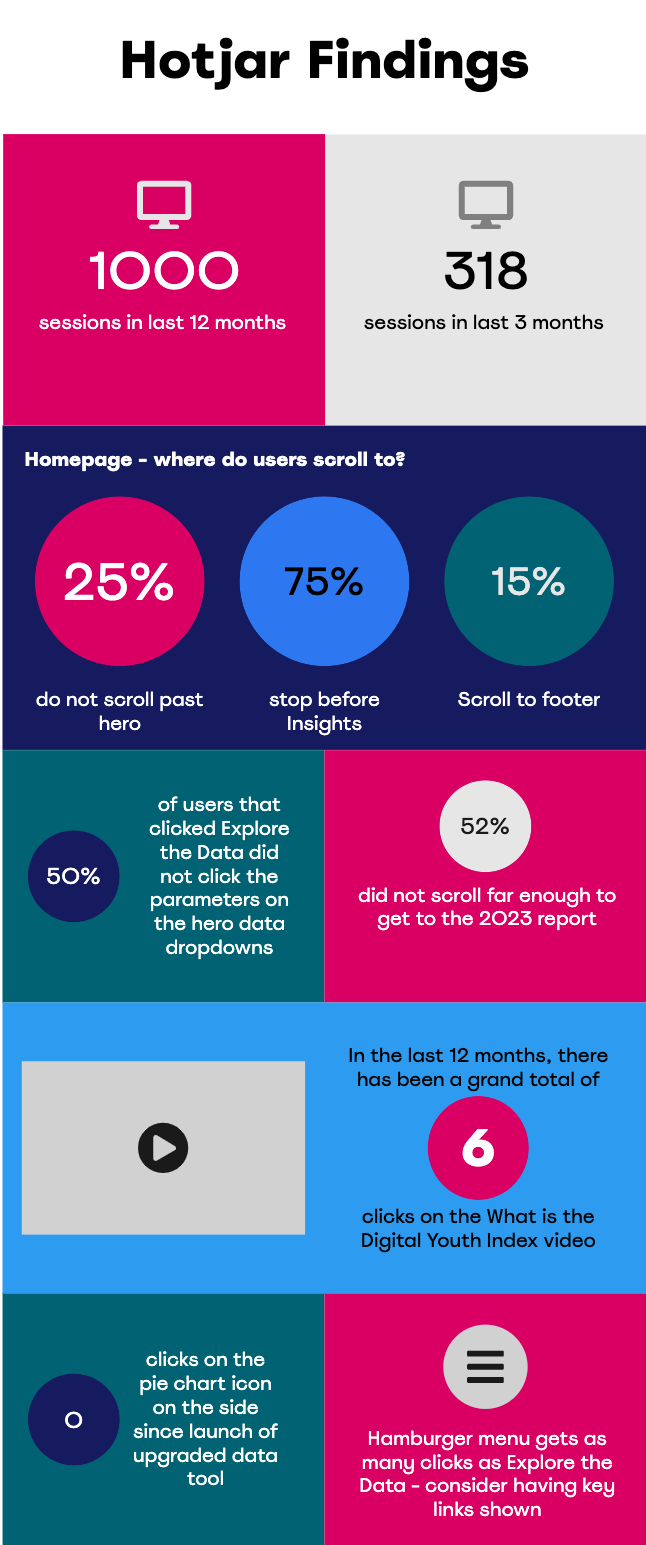
The main points we took from this were that:
- people don’t know to scroll past the initial hero image
- a lot of people miss the fact that there are other resources other than the data and graphs
- people who do want the graphs just wanted a simple way to get to it
Clearly there is only so much you can glean from pure numbers - we needed a little more qualitative information.
We continued with user panels
The team had a number of keen users who were willing to attend an online session around giving feedback on the homepage.
We set about constructing a series of questions which would get to WHY users came to the site and HOW they viewed and used the homepage
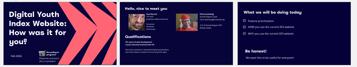
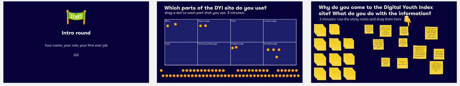
We had a good uptake of potential users and had to run the same session for two groups of 8 users. We had an hour with them and used a Miro board to try and make the session interactive.
During the first session, we ran into disaster! Users who weren’t a full member of the miro board couldn’t interact! So on the fly we changed some of the voting systems to use comments in Teams and one like == one comment. Phew!
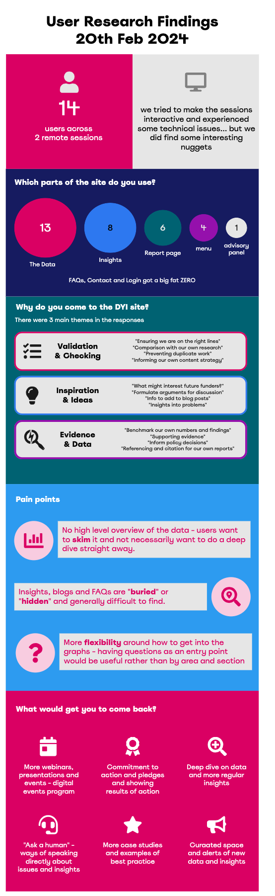
After the sessions I collated the findings - grouped the comments together into themes and produced another infographic for the team
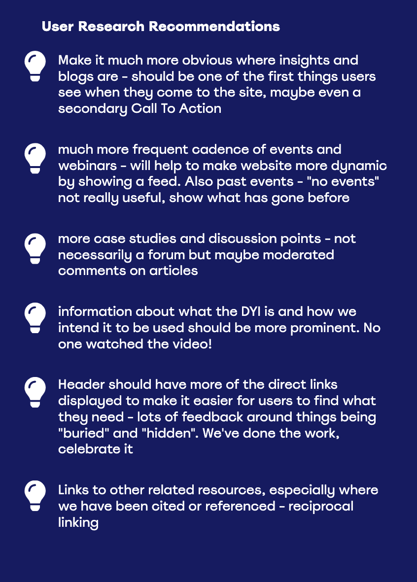
Next, some wireframes
Using this information we were able to collaboratively produce some wireframes which reflected these potential changes. The team selected the one that most closely aligned with their desired outcomes. In other words, option 2.
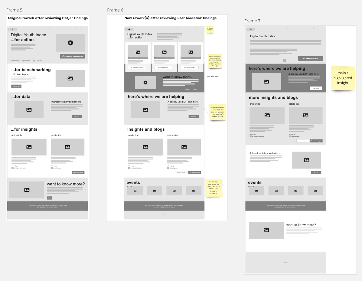
Sent to the developers...
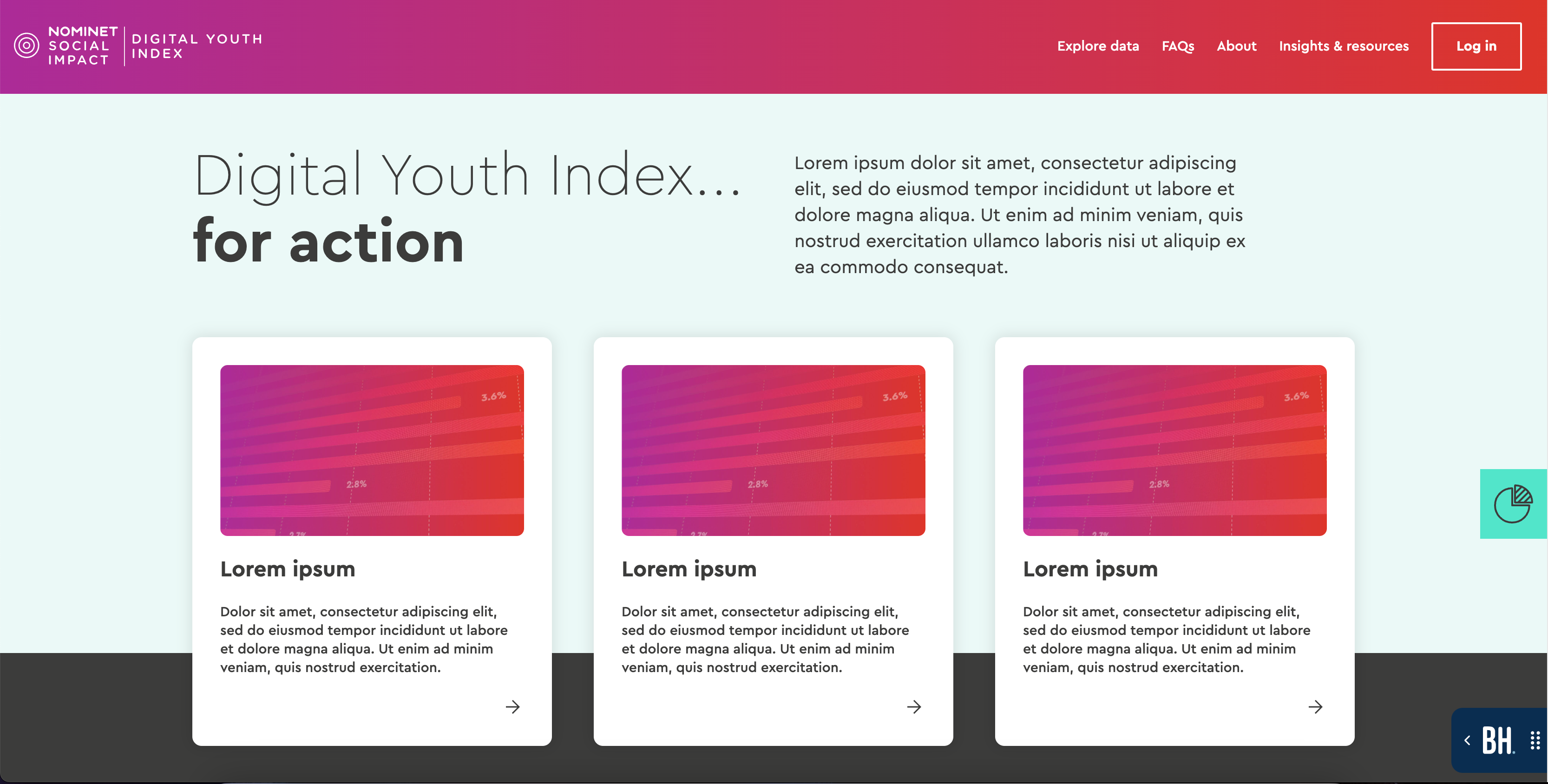
The team were able to pass this across to their digital agency and it’s currently in development! First iteration with some placeholders looks like this:
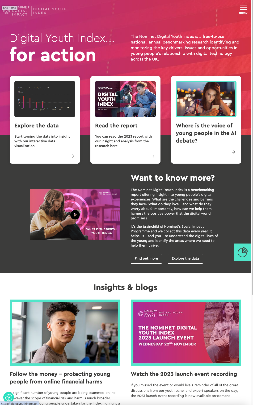
After a bit more time, the rework is now live! Check out https://digitalyouthindex.uk/
Getting people to the info they need more quickly