
The initial problem
While coming up with designs for our web domain manager software, one bit of functionality was the ability to see the history of a domain (or other editable entity). Our product was based on iterating a previous product called Dragon where the way of viewing history was to pick a date from a datepicker and have a side by side view of the changes.
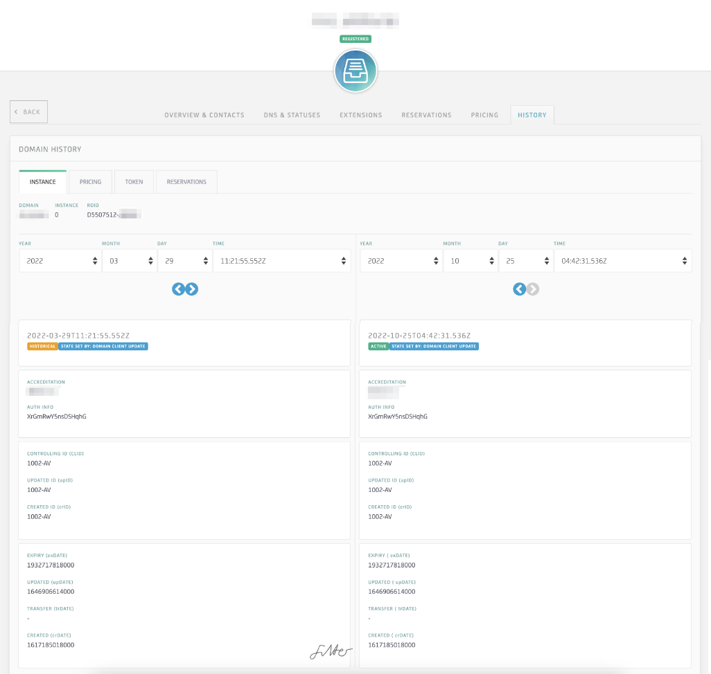
The view from the existing tool - Dragon - which shows the datepicker-based navigation
This was a successor to another domain management tool - Enchilada - which was being sunsetted. The functionality around history had not been workshopped adequately and this new tool was not being used. We had to find out why so we did not repeat the same mistakes
The process
Since this would be used primarily by internal users, the first step was to speak to them! I asked for some willing volunteers and was able to get some insights into how and why they were using Dragon.
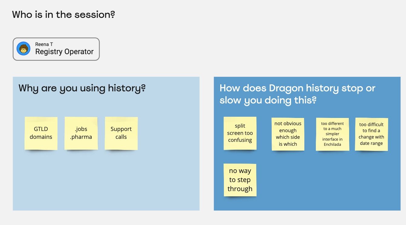
Reena
I had a face to face session with Reena and she ran me though her process. We made some notes using Miro.
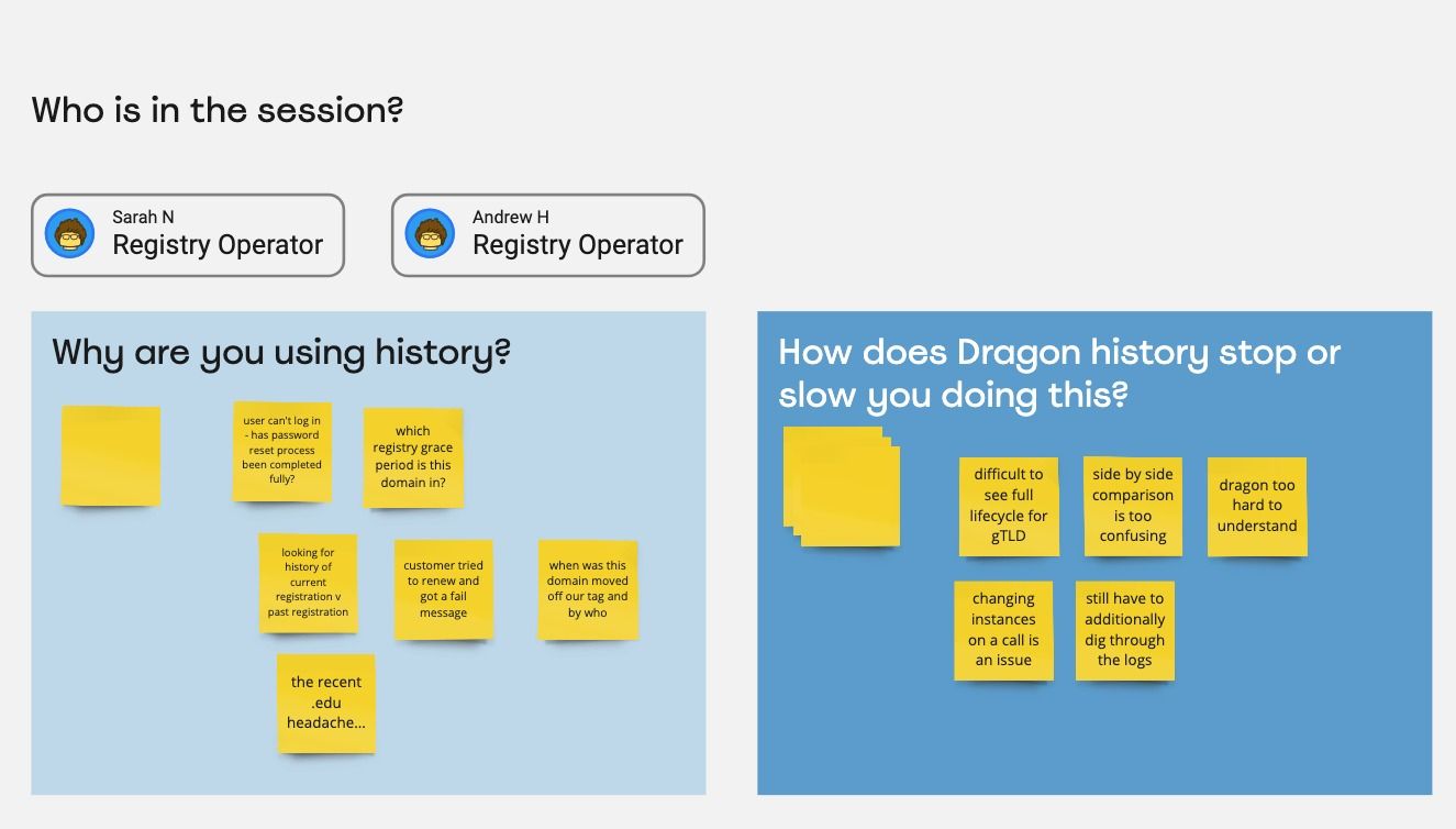
Andrew and Sarah
Andrew was keen to point out that the current way in Dragon was not working.
- Often he and his colleagues would go back to Enchilada to do what they needed.
- Instead of knowing which date they were looking for, they need to see when individual fields had changed. This was often done by stepping though changes.
Based on this feedback it was clear that there was a lot of user frustration at the new tool which had been provided. It was clear that users had not been consulted at the previous iteration of the tool.
Summary of user feedback
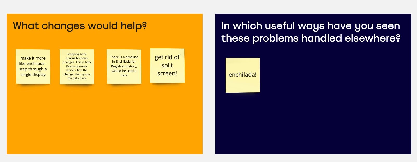
- Enchilada's way of handling history is MUCH better
- Users prefer single view of data where changes are highlighted rather than comparison of 2 sets of data
- Stepping through changes in Enchilada is the way users would prefer to use history
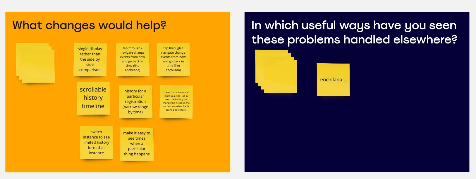
- Users value a timeline view of changes
- Narrow down changes shown to a particular field
The design
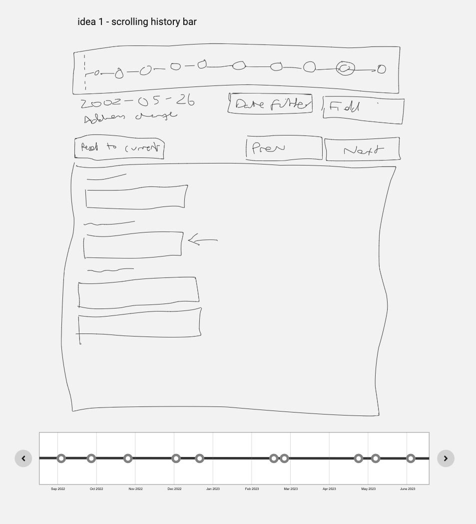
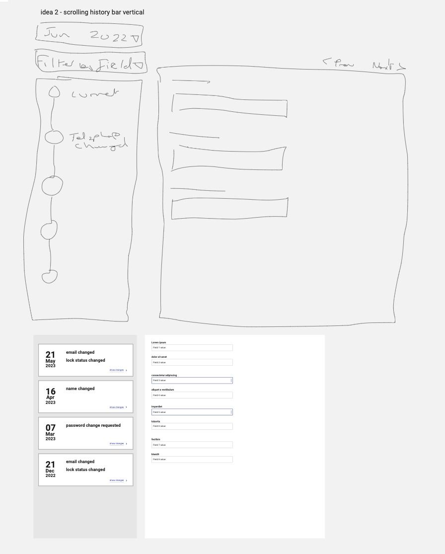
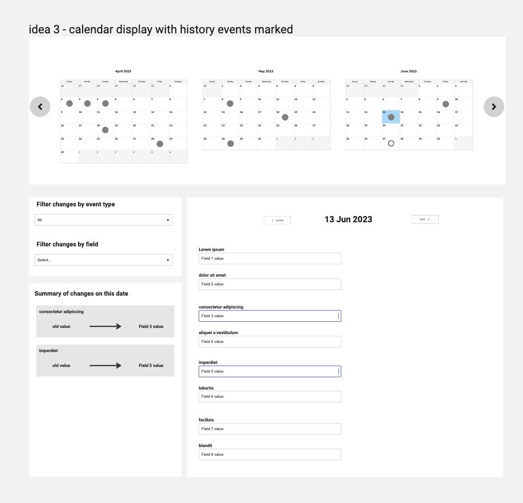
I took this feedback and worked up a few different ideas around how we could display a timeline of events rather than just a series of dates.
I then took these back to the users I had spoken to and asked them to vote and comment on these, to get a feel for what would work best for them. I also invited Karen who is the team lead.
I did this with a simple dot-voting and sticky note setup on Miro and split the design into two different aspects - timeline and change comparison.
Design feedback
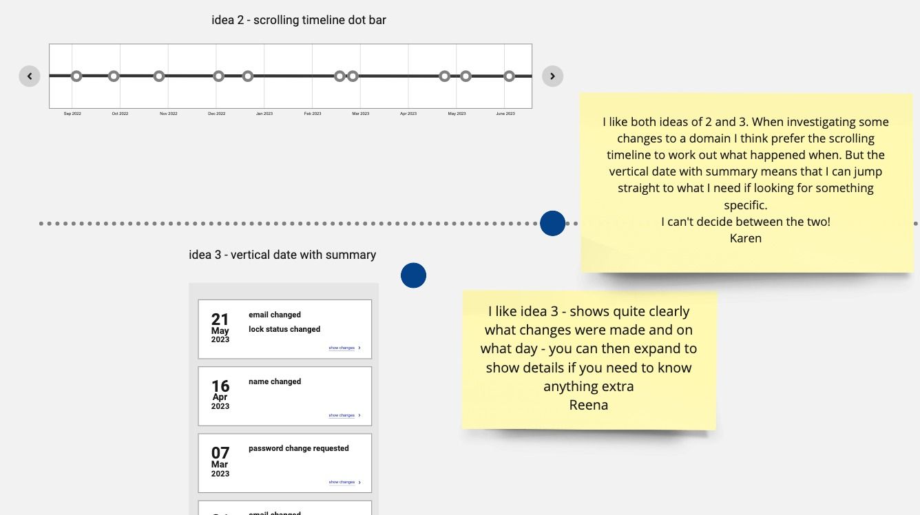
Timeline display
I gave 4 options for people to vote on, using different options of good examples I had seen in other web apps for displaying timelines.
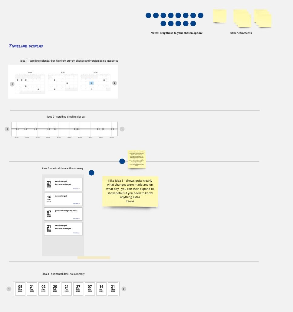
Most users seemed to prefer the stacked and expanded cards as a way of showing events where data had changed
Change comparison display
I set up a similar voting display for how to display changes that had been made rather than when a change had happened.
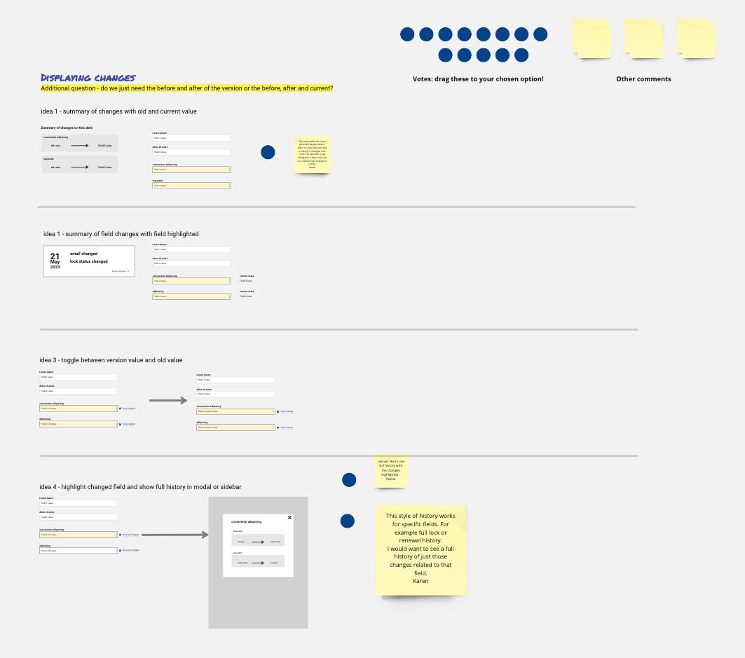
The clear preferred solution was to have a modal or popover which displayed all the changes for a field - this suits the way that the operators work
And then… it hit the fan
Originally, for this section which was called “Next steps”, I wrote:
From here, we need to construct these ideas into a wireframe in the context of the object being examined - domain, host, contact. The fields will be different and we need to validate that these ideas work for all the types of field we will be looking at.
But then priorities changed…
“We don’t have time or resource to do this… the pragmatic approach is to take what we have and reuse that”
Not ideal but this is the reality of the business world. New work comes in, some priorities disappear or rise to the top. I argued against this decision:
- It’s very short term thinking;
- You won’t get chance to return to this work to improve it if you are struggling to fit it into the development cycle from new;
- Putting out something which is literally MVP as your finished project is going to hurt your reputation;
- It will lead to more out of control feature requests rather than improving and iterating what we have as it will appear “broken”.
These concerns were listened to but not heard. Or the other way round. Whichever - I was sent on my way to go and draw UI sketches for waterfall requirements.
It felt like I had failed - but there are no failures, only opportunities to learn.